How Does Fixed, Fluid, Adaptive and Responsive Web Design Differ from Each Other!
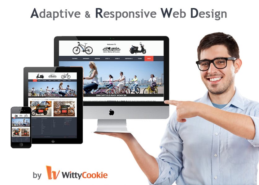
Adaptive & Responsive Website Design in Canada
One of the important tasks of a web designer is to ensure that the website looks different in multiple browsers and on different devices. With so many different devices available in today’s world, it is essential that the layout of the website changes so as to match the device the visitor uses. Discussed below are different types of web designs and layouts reflecting the difference between them:
Fixed websites
They have fixed width and re-sizing browser or viewing it on different devices doesn’t change the appearance of website. They require horizontal scrolling and a site do not appear good on smart phones and tablets. The fixed-width layout makes it easy to use and customize in terms of design. As the width is same for all browser, the images, forms, video and other content does not involve any hassle. There is no requirement for min-width or max-width and even though a website is designed to be compatible with smallest screen resolution i.e. 800×600, the content is wide enough and is easily legible.
However, fixed-width layout creates a lot of white space in large screen resolutions spoiling ‘divine proportion’ and ‘Rule of Thirds’. Smaller screen resolution requires a horizontal scroll bar and those with larger resolutions require seamless textures, patterns and image continuation. Such web designs score low in terms of usability.
Fluid websites
It is built using percentage for widths, which is why the columns are relative to one another and the browser that enables it to scale up and down freely. This web design enables the website to render the layout dimension based on the viewing range. Proper coding ensures everything is in balance. The change in technology or ways in which one browses the net does not affect fluid websites.
It requires long time to see that the website at different viewing widths breaks the design at which place. Poor coding increases inconsistency in position, margins, size etc. this web design is not future proof and requires periodic updates to adapt with the technological changes.
Adaptive website
The Adaptive approach is best for those websites that undergo frequent design change. This approach introduces media queries to specific device sizes such as those having small monitors, mobile and tablets. The adaptive website ensures optimal viewing experience for most of the possible users and has set number of layouts. It does not require much testing of a website at different widths to see how it will perform.
The designs have problems in specified ranges and are not future proof. Those users who are not using popular devices might have to settle for less than optimal experience.
Responsive website
They are based on fluid grid and utilize media queries to control the design and its content as it reduces or increases with the browser or device. It requires less maintenance, has one URL thus better SEO, is easy to use, navigate and track and is future proof.
Responsive design continues to develop and has own rules and techniques, the implementation can take longer time, has limited resources and has increased load time.


